|
| Not a Good Start |
Ye olde Monster Manual of A.D. 1977 contains a lot more illustrations than the original brown books of OD&D and so in many cases created the visual basis for many of D&D's monsters. Even where OD&D had illustrations, the MM often represented the monsters completely differently (eg, elves and bugbears).
It doesn't take too much reading of entries in the manual to realize that Gygax and the artists were not working closely together and the result is that some monsters' illustrations don't match their descriptions at all well. Because of the power of the image compared to the written word, the illustrations became the standard for players and later artists even when there was a major disjunction between the designer's intent and the artist's renderings.
These days I try to ignore the pictures in the MM and describe monsters without reference to them. I've found that this tends to create a much more "creepy" atmosphere at the table. Partly this is because I feel freer to embellish individual monsters with visual quirks and partly it allows the players' imaginations to go in directions that neither I nor the monsters' designers expected. Often, this is much more frightening than the "standard" version of the monster.
Another problem with the illustrations is that they are all black and white whereas many of the descriptions are surprisingly colourful when read over. For example, bugbears have "light yellow to yellow brown" skin and can have brick red hair. Goblins are similar.
Indeed, reading the humanoid descriptions brings out the similarities between the whole family of
unseelie beings, from kobolds to goblins to hobgoblins to bugbears and gnolls, ogres, and even to the hill giants. The whole class becomes more obviously connected, I think, than they do from the images alone and the ranger's list of foes is therefore more easily understood.
The orc is a bit of an oddball in this collection. Obviously the name is a direct lift from Tolkien rather than the fairytales that inspired the rest of the list but both the image and description seem to take pains to not resemble the original, leading to the classic D&D schism of "snouts or not-snouts". I've grown to dislike the whole idea of having orcs in the game so I've moved into the "don't care anymore" camp on this one. If I have orcs, they are Tolkien orcs, but mostly I don't have them at all.
Then there's the kobolds. Where DCS got the idea for the scaly lizard men is a bit of a puzzle. Here's the description in full:
"The hide of kobolds runs from very dark rusty brown to a rusty black. They have no hair. Their eyes are reddish and their small horns are tan to white. The favour red or orange garb." Strangely, however, they are mentioned as being oviparous earlier in the text and perhaps that's what sparked the idea of reptilian creatures.
 |
From Tom McKearm's Seminal
Elves, Dwarves, Cost Accountants
and other Mythical Creatures |
In my CSIO campaign, kobolds are as depicted by DCS and others but in other games I describe them as basically evil gnomes with stubby horns, which I think is much more like what Gygax was thinking of based on the original Germanic myths and folklore (see left - or maybe not).
The Top Ten
Here's my list of the least inspiring illustrations in MM (not necessarily the worst technically).
- The Owlbear. It's a fairly weird idea but a bear-like thing with a giant owl's huge eyes should be a fairly unnerving encounter. The illustration is more Bruce Forsyth than Lovecraft, however (you can tell it's a wig).
- Kobolds. What we have here is a different monster.
- Orcs. It's a pig with a spear. Just go away.
- Brain Mole. "Zoom in" lines don't make a mole look any more exciting. It just looks like it might be a star-prize in the world's least enticing game-show. The name "Brain mole" sounds unpleasant and a bit Hammer Horror/70's Dr Who but the illustration just undercuts all that at a stroke.
- Ropers. Read the text. Sound's pretty horrible. Now look at the picture. Looks like angry plasticine.
- Goblin. This is a classic "the artist is thinking Tolkien; the writer is thinking George MacDonald". Totally un-atmospheric depiction of an ugly soldier.
- Water Elemental. There are plenty of monsters with no illustration and this should have been one of them.
 |
| "Welcome to Hades!" |
- Larva. They're dead angry, they are. We have some harmless-looking pinheads. The lack of scale is a major problem. You can fix them up somewhat by giving them all Bruce Campbell's face.
- Ent. Sorry, Treant. Substantially smaller than the listed "small" ent, the one in the picture looks like a comic "special branch" pantomime-tree with extra-knobbly knees.
- Nixie. Apparently he's friendly. Look - he's waving. I'd admit that it's hard to get across the more alien aspects of the textual description in a B&W line drawing but that's a reason to not have an illustration, not to have this. In this case the technical aspects of the drawing are a problem too.
- Make room for the hobgoblin. Gygax accidentally swapped the names of goblins and hobgoblins (hobgoblins are smaller - that's what "hob" means [edit: no it isn't; see reply to first comment]) but that's not a major issue compared with them being shown as samurai for no obvious reason. Once again, the picture serves to muddy the connection with the rest of the goblinoid/humanoid/giant class clan.
The Sequel
Monster Manual II of course has several problem monsters. The artwork was apparently done very quickly due to the on-going miss-management of TSR at the time so it's perhaps a bit harsh to complain but no list of uninspiring depictions could be complete without a special mention of the Modrons.
Clearly inspired by
E.A.Abbot's classic "Flatland", the Modrons more or less duplicate that books' hierarchy in 3D with the same general underlying idea that more sides=more important. It's weird and strange and great fun. And totally undermined by the stiffest and most mundane drawings imaginable.
The Modrons point up the essential problem with all monster art - a totally alien concept of intelligent shapes is something that people can actually hold in their minds and deal with as an imaginary thing but once it's put on paper as a visual it falls apart. The same goes to a greater or lesser degree with all
monsters. The fact of being monsters carries with it an element of being outlandish, freakish, or just plain odd. Those characteristics don't easily sit on a page no matter how good the artist is.
 |
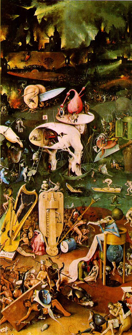
| Perhaps a bit too weird |
Even when an artist captures something unsettling which evokes that feeling of being beyond the pale that any really good D&D adventure has, repetition dulls the effect. Bosch's "knife ears" might make a striking encounter but if the DM places it regularly then eventually the power of the illustration is lost - it becomes a cliché, and much more quickly than it does when it lives only in the mind of the players, in my opinion. And the same goes for miniatures, of course.
I've mentioned before that I'm not a fan of making every monster a one-shot; there's certainly room for fantasy races as well as singular monsters and freaks, but using the same illustrations as reference time and time again is a killer for any sense of fantasy. When those illustrations are simply bad then using them is much worse than using nothing.
 Here's some pictures I took at the British Museum one lunch time in 2015. They're all reconstructions of ancient Athenian statues of their patron deity, the great Athena. The golden statue is based on the work of Phidias for the Parthenon and is called Athena Lemnia, which is now lost but known from copies of varying ages and certainty. The purpose of this (and the other statue below) was to give some idea of how these works would have looked when new. Marble was painted and bronze gilded or polished to a high shine, with glass for the eyes. In fact, the eyes were the most striking aspect of the first statue and the second photo only hints at the life-like quality of the statue's gaze.
 Naturally enough, the Christians despised it in much the same way that they hated anything bright or positive and it was destroyed, probably in the orgy of book-burning and murder which led us into the Dark Ages in the name of the Prince of Peace.